About this Project
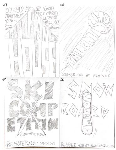
This poster explores typography as the primary visual element within an event promotion context. Designed for a fictional snowboard competition, the piece combines expressive type with minimal illustration to capture energy and movement.
The layout is driven by a winding snow path that subtly forms “SBC,” guiding the viewer’s eye through the composition while reinforcing the event identity. Bold, modern typography contrasts against the winter backdrop, creating a dynamic and youthful tone.
The project highlights how typography can function beyond information—acting as both a structural and atmospheric element within a composition.
Project Scope
- Typography
- Poster Design
- Layout & Composition
- Visual Hierarchy
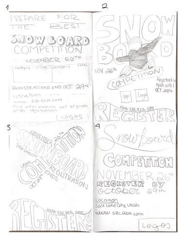
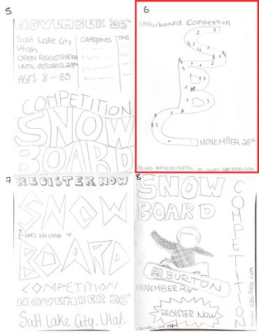
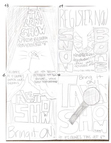
Sketches
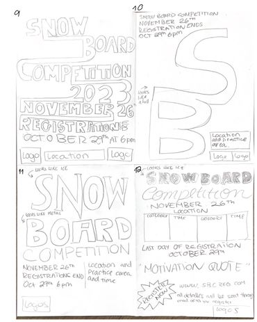
Final Poster

Copyright © 2026 Nicole Garzon - All Rights Reserved.
This website uses cookies.
We use cookies to analyze website traffic and optimize your website experience. By accepting our use of cookies, your data will be aggregated with all other user data.